Hi Geoffrey,
I have identified correct css for those group buttons and changed the background color while mouse out and mouse in, but I didn't find anything to change group button corners to change to show rounded corners. I have tried by implementing "background-image:none", but no use. Please check the css where I need to change.
apsx page...
<%@ Page Language="C#" %>
<%@ Register Assembly="Ext.Net" Namespace="Ext.Net" TagPrefix="ext" %>
<!DOCTYPE html PUBLIC "-//W3C//DTD XHTML 1.0 Transitional//EN" "http://www.w3.org/TR/xhtml1/DTD/xhtml1-transitional.dtd">
<script runat="server">
</script>
<html xmlns="http://www.w3.org/1999/xhtml">
<head runat="server">
<title></title>
<link href="css/btnStyles.css" rel="stylesheet" type="text/css" />
<style type="text/css">
.my-toolbar .x-toolbar .x-toolbar-ct
{
margin-top: 4px;
}
</style>
</head>
<body>
<form id="form1" runat="server">
<ext:ResourceManager ID="resMngr" runat="server" />
<ext:Viewport ID="Viewport1" runat="server">
<Items>
<ext:Panel ID="pnlTops" runat="server" Height="37" Border="false" BodyStyle="background-color:#424E5A">
<Items>
<ext:Toolbar ID="tb" runat="server" Cls="my-toolbar" Flat="true">
<Items>
<ext:ButtonGroup ID="buttonGrpColorTest" runat="server" Cls="my-group-button" OverCls="my-group-over-button">
<Items>
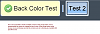
<ext:Button ID="btnColorTest" runat="server" Text="Back Color Test" Icon="Accept" OverCls="my-over-btnStyle" ToggleGroup="tg1" EnableToggle="true" Pressed="true">
</ext:Button>
</Items>
</ext:ButtonGroup>
<ext:ToolbarSeparator />
<ext:ButtonGroup ID="ButtonGroup1" runat="server">
<Items>
<ext:Button ID="Button1" runat="server" Text="Test 2" ToggleGroup="tg1" EnableToggle="true">
</ext:Button>
</Items>
</ext:ButtonGroup>
<ext:ToolbarFill />
</Items>
</ext:Toolbar>
</Items>
</ext:Panel>
</Items>
</ext:Viewport>
</form>
</body>
</html>
CSS for that file
.my-group-button .x-btn-group {
    padding:1px;
}

.my-group-button .x-btn-group-header {
    padding:2px;
    text-align:center;
}

.my-group-button .x-btn-group-tc {
	background: #FFFFCC repeat-x 0 0;
	overflow:hidden;
}

/*
.my-group-button .x-btn-group-tl {
	background: transparent no-repeat 0 0;
	padding-left:3px;
    zoom:1;
}

.my-group-button .x-btn-group-tr {
	background: transparent no-repeat right 0;
	zoom:1;
    padding-right:3px;
}
*/

.my-group-button .x-btn-group-bc {
	background: #FFFFCC repeat-x 0 bottom;
    zoom:1;
}

.my-group-button .x-btn-group-bc .x-panel-footer {
    zoom:1;
}

/*
.my-group-button .x-btn-group-bl {
	background: transparent no-repeat 0 bottom;
	padding-left:3px;
    zoom:1;
}

.my-group-button .x-btn-group-br {
	background: transparent no-repeat right bottom;
	padding-right:3px;
    zoom:1;
}

*/

.my-group-button .x-btn-group-mc {
    border:0 none;
    padding:1px 0 0 0;
    margin:0;
}

.my-group-button .x-btn-group-mc .x-btn-group-body {
    background-color:#FFFFCC;
    border: 0 none;
}

.my-group-button .x-btn-group-ml {
	background: #FFFFCC repeat-y 0 0;
	padding-left:3px;
    zoom:1;
}

.my-group-button .x-btn-group-mr {
	background: #FFFFCC repeat-y right 0;
	padding-right:3px;
    zoom:1;
}

.my-group-button .x-btn-group-bc .x-btn-group-footer {
    padding-bottom:6px;
}

.my-group-button .x-panel-nofooter .x-btn-group-bc {
	height:3px;
    font-size:0;
    line-height:0;
}

.my-group-button .x-btn-group-bwrap {
    overflow:hidden;
    zoom:1;
}

.my-group-button .x-btn-group-body {
    overflow:hidden;
    zoom:1;
}

.my-group-button .x-btn-group-notitle .x-btn-group-tc {
	background: transparent repeat-x 0 0;
	overflow:hidden;
    height:2px;
}


.my-group-button .x-btn-text {
    cursor:pointer;
	white-space: nowrap;
    padding:0;
    height:16px
}

.my-group-button .x-btn-icon .x-btn-text{
    background-position: center;
	background-repeat: no-repeat;
}

.my-group-button .x-btn-text-icon .x-btn-icon-small-left .x-btn-text{
    background-position: 0 center;
	background-repeat: no-repeat;
    padding-left:18px;
    height:16px;
}

.my-group-button .x-btn-text-icon .x-btn-icon-small-top .x-btn-text{
    background-position: center 0;
	background-repeat: no-repeat;
    padding-top:18px;
}

.my-group-button .x-btn-text-icon .x-btn-icon-small-right .x-btn-text{
    background-position: right center;
	background-repeat: no-repeat;
    padding-right:18px;
    height:16px;
}

.my-group-button .x-btn-text-icon .x-btn-icon-small-bottom .x-btn-text{
    background-position: center bottom;
	background-repeat: no-repeat;
    padding-bottom:18px;
}


.my-group-over-button .x-btn-group {
    padding:1px;
}

.my-group-over-button .x-btn-group-header {
    padding:2px;
    text-align:center;
}

.my-group-over-button .x-btn-group-tc {
	background: #333333 repeat-x 0 0;
	overflow:hidden;
}


.my-group-over-button .x-btn-group-tl
{
	background: #333333 no-repeat 0 0;
	padding-left:3px;
    zoom:1;
}

.my-group-over-button .x-btn-group-tr
{

	background: #333333 no-repeat right 0;
	zoom:1;
    padding-right:3px;
}


.my-group-over-button .x-btn-group-bl {
	background: #333333 no-repeat 0 bottom;
	padding-left:3px;
    zoom:1;
}

.my-group-over-button .x-btn-group-br {
	background: #333333 no-repeat right bottom;
	padding-right:3px;
    zoom:1;
}

.my-group-over-button .x-btn-group-bc {
	background: #333333 repeat-x 0 bottom;
    zoom:1;
}

.my-group-over-button .x-btn-group-bc .x-panel-footer {
    zoom:1;
}

/*
.my-group-over-button .x-btn-group-bl {
	background: transparent no-repeat 0 bottom;
	padding-left:3px;
    zoom:1;
}

.my-group-over-button .x-btn-group-br {
	background: transparent no-repeat right bottom;
	padding-right:3px;
    zoom:1;
}

*/

.my-group-over-button .x-btn-group-mc {
    border:0 none;
    padding:1px 0 0 0;
    margin:0;
}

.my-group-over-button .x-btn-group-mc .x-btn-group-body {
    background-color:#333333;
    border: 0 none;
}

.my-group-over-button .x-btn-group-ml {
	background: #333333 repeat-y 0 0;
	padding-left:3px;
    zoom:1;
}

.my-group-over-button .x-btn-group-mr {
	background: #333333 repeat-y right 0;
	padding-right:3px;
    zoom:1;
}

.my-group-over-button .x-btn-group-bc .x-btn-group-footer {
    padding-bottom:6px;
}

.my-group-over-button .x-panel-nofooter .x-btn-group-bc {
	height:3px;
    font-size:0;
    line-height:0;
}

.my-group-over-button .x-btn-group-bwrap {
    overflow:hidden;
    zoom:1;
}

.my-group-over-button .x-btn-group-body {
    overflow:hidden;
    zoom:1;
}

.my-group-over-button .x-btn-group-notitle .x-btn-group-tc {
	background: transparent repeat-x 0 0;
	overflow:hidden;
    height:2px;
}


.my-group-over-button .x-btn-text {
    cursor:pointer;
	white-space: nowrap;
    padding:0;
    height:16px;
    color:white
}

.my-group-over-button .x-btn-icon .x-btn-text{
    background-position: center;
	background-repeat: no-repeat;
}

.my-group-over-button .x-btn-text-icon .x-btn-icon-small-left .x-btn-text{
    background-position: 0 center;
	background-repeat: no-repeat;
    padding-left:18px;
    height:16px;
}

.my-group-over-button .x-btn-text-icon .x-btn-icon-small-top .x-btn-text{
    background-position: center 0;
	background-repeat: no-repeat;
    padding-top:18px;
}

.my-group-over-button .x-btn-text-icon .x-btn-icon-small-right .x-btn-text{
    background-position: right center;
	background-repeat: no-repeat;
    padding-right:18px;
    height:16px;
}

.my-group-over-button .x-btn-text-icon .x-btn-icon-small-bottom .x-btn-text{
    background-position: center bottom;
	background-repeat: no-repeat;
    padding-bottom:18px;
}

.my-group-over-button .x-btn-over .x-btn-tl{
	background-position: -6px 0;
}

.my-group-over-button .x-btn-over .x-btn-tr{
	background-position: -9px 0;
}

.my-group-over-button .x-btn-over .x-btn-tc{
	background-position: 0 -9px;
}

.my-group-over-button .x-btn-over .x-btn-ml{
	background-position: -6px -24px;
}

.my-group-over-button .x-btn-over .x-btn-mr{
	background-position: -9px -24px;
}

.my-group-over-button .x-btn-over .x-btn-mc{
	background-position: 0 -2168px;
}

.my-group-over-button .x-btn-over .x-btn-bl{
	background-position: -6px -3px;
}

.my-group-over-button .x-btn-over .x-btn-br{
	background-position: -9px -3px;
}

.my-group-over-button .x-btn-over .x-btn-bc{
	background-position: 0 -18px;
}


.my-btnStyle .x-btn{
	cursor:pointer;
	white-space: nowrap;
}

.my-btnStyle .x-btn button{
    border:0 none;
    background-color:transparent;
    padding-left:3px;
    padding-right:3px;
    cursor:pointer;
    margin:0;
    overflow:visible;
    width:auto;
    -moz-outline:0 none;
    outline:0 none;
}

.my-btnStyle .x-btn-br{
	width:3px;
	height:3px;
	background:no-repeat -3px -3px;
}

.my-btnStyle .x-btn-bl{
	width:3px;
	height:3px;
	background:no-repeat 0 -3px;
}

.my-btnStyle .x-btn-tl{
	width:3px;
	height:3px;
	background:no-repeat 0 0;
}

.my-btnStyle .x-btn-tr{
	width:3px;
	height:3px;
	background:no-repeat -3px 0;
}


.my-over-btnStyle .x-btn-br{
	width:3px;
	height:3px;
	background:no-repeat -3px -3px;
	background-color:#333333
}

.my-over-btnStyle .x-btn-bl{
	width:3px;
	height:3px;
	background:no-repeat 0 -3px;
	background-color:#333333
}

.my-over-btnStyle .x-btn-tl{
	width:3px;
	height:3px;
	background:no-repeat 0 0;
	background-color:#333333
}

.my-over-btnStyle .x-btn-tr{
	width:3px;
	height:3px;
	background:no-repeat -3px 0;
	background-color:#333333
}

.my-over-btnStyle .x-btn-mr {
background-color: #333333;
background-image: none;
background-repeat: no-repeat;
background-attachment: scroll;
background-position: -3px -24px;
background-clip: border-box;
background-origin: padding-box;
background-size: auto auto;
}

.my-over-btnStyle .x-btn-ml {
    width: 3px;
    background-color: #333333;
    background-image: none;
    background-repeat: no-repeat;
    background-attachment: scroll;
    background-position: 0px -24px;
    background-clip: border-box;
    background-origin: padding-box;
    background-size: auto auto;
}

.my-over-btnStyle .x-btn-mc {
    background-color: #333333;
    background-image: none;
    background-repeat: repeat-x;
    background-attachment: scroll;
    background-position: 0px -1096px;
    background-clip: border-box;
    background-origin: padding-box;
    background-size: auto auto;
    vertical-align: middle;
    text-align: center;
    padding: 0px 5px;
    cursor: pointer;
    white-space: nowrap;
}

.my-over-btnStyle .x-btn-bc
{
    height: 3px;
    background-color: #333333;
    background-image: none;
    background-repeat: repeat-x;
    background-attachment: scroll;
    background-position: 0px -15px;
    background-clip: border-box;
    background-origin: padding-box;
    background-size: auto auto;
}

.my-over-btnStyle .x-btn-tc {
    height: 3px;
    background-color: transparent;
    background-image: none;
    background-repeat: repeat-x;
    background-attachment: scroll;
    background-position: 0px -6px;
    background-clip: border-box;
    background-origin: padding-box;
    background-size: auto auto;
}

Originally Posted by
geoffrey.mcgill

Maybe this can help, see
http://vimeo.com/10076549
The same technique can be applied to any elements that require css modification.


